In Short
By redesigning the Plans Overview with clearer value communication, consistent pricing alignment, and side-by-side plan comparison, we reduced upgrade friction and improved plan transparency. Early signals showed stronger engagement, increased upgrade confidence, and a more intuitive B2B subscription experience.
Trustpilot’s subscription plans had grown increasingly complex over time, making it hard for businesses to understand what they were paying for and what options were available. This project aimed to redesign the Plans Overview to give customers a clearer picture of their active plan, available upgrades, and key benefits, helping them make confident, informed choices while reducing support friction.
Initiative
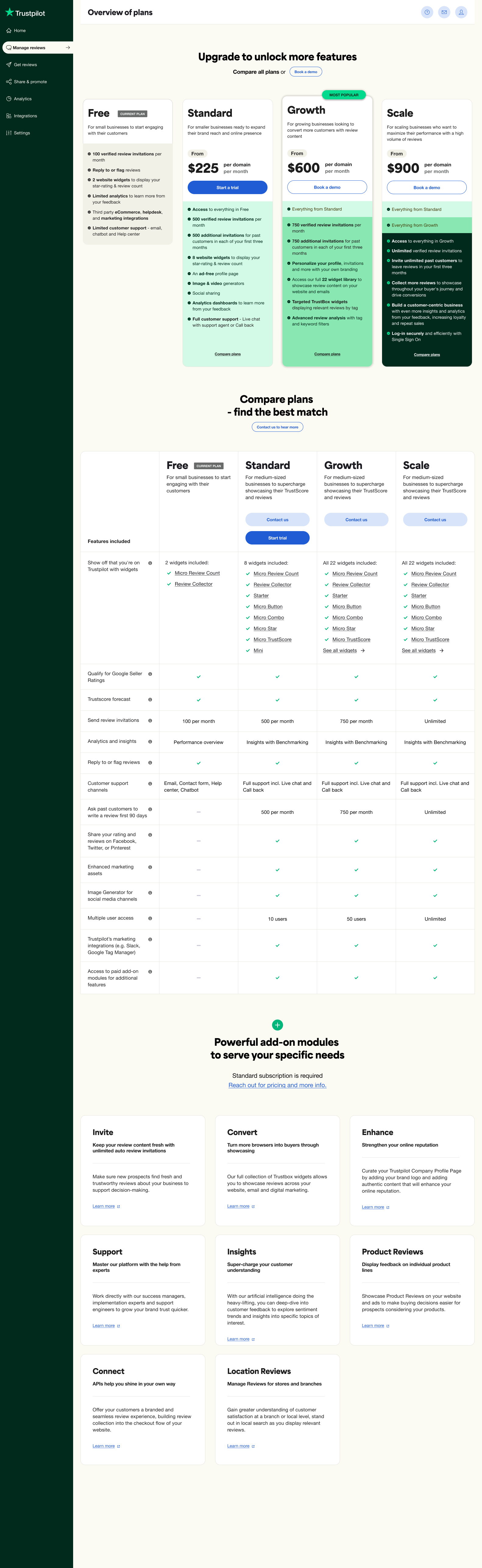
Goal: Enhance pricing transparency and consistency for business customers by aligning the in-app upgrade page with the external pricing page. Introducing the Growth and Scale plans within the app was the first step toward enabling contextual upsell opportunities and supporting more informed decision-making across the B2B experience.
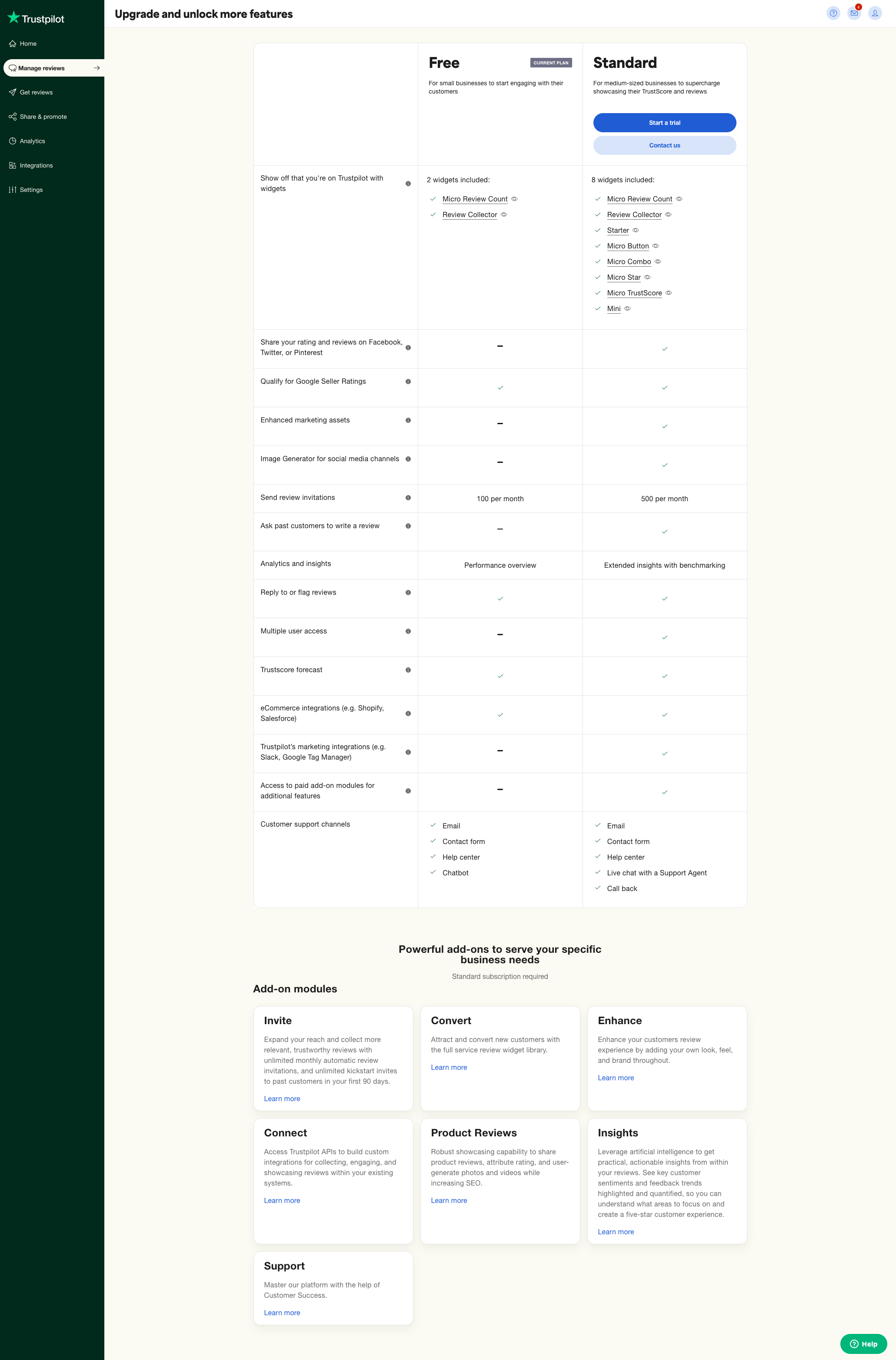
Problem: Business customers expressed confusion about the content and benefits of each plan, as well as uncertainty about which plan they were currently on. The previous plans overview lacked clarity and visual consistency, creating friction in the upgrade journey and lowering conversion rates.
Research: To better understand how businesses interacted with their subscription plans, I conducted exploratory interviews with a mix of new, upgrading, and long-term customers. Each session followed a semi-structured format, focusing on how users discovered, compared, and managed their plans within the platform. I recruited participants through customer success teams to ensure a diverse range of business sizes and plan types.
During the sessions, I used screen-sharing and open-ended prompts to observe real navigation behaviors and capture pain points in context. The research revealed consistent confusion around plan value, upgrade options, and terminology — highlighting the need for a clearer overview that communicated benefits at a glance.
Solution
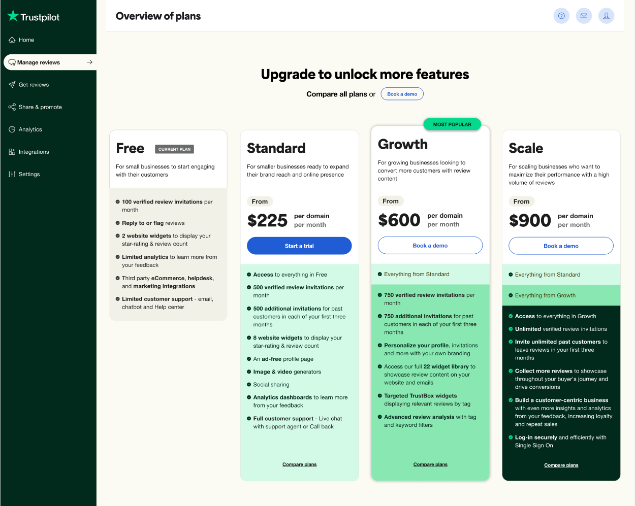
I redesigned the upgrade experience to clearly present all available plans side by side, mirroring the structure and language of the public pricing page. The new design emphasized transparency and comparability through:
• A unified layout and consistent hierarchy between the app and website
• Clear visual grouping of plan tiers and included features
• Simplified language and more intuitive calls to action
• Added visibility of Growth and Scale plans to support upselling
This approach ensured users could easily identify which plan best fit their needs while maintaining brand alignment and trust.
Outcome
The updated overview improved users’ understanding of plan differences and value propositions, reducing confusion and hesitation during the upgrade process. Early analytics and user feedback showed stronger engagement with plans and increased confidence in selecting upgrades. The new structure also laid the groundwork for future contextual upsell opportunities directly within the product.
Before
After